As a designer, I’m often asked about simple and practical methods businesses can implement to enhance their strategy and brand identity without bringing on a designer or breaking the bank. As we currently find ourselves in a time where nearly every meeting or presentation is virtual, we thought it would be helpful to share some practical steps to take to enhance the aesthetic of your presentations, with the ultimate goal of catching more attention, facilitating the flow of information and converting prospects into clients.
We encourage you to take a moment to review your current presentation decks from an observer’s vantage point, take notes on your observations and emotions, and keep those close by as we walk through these tips!
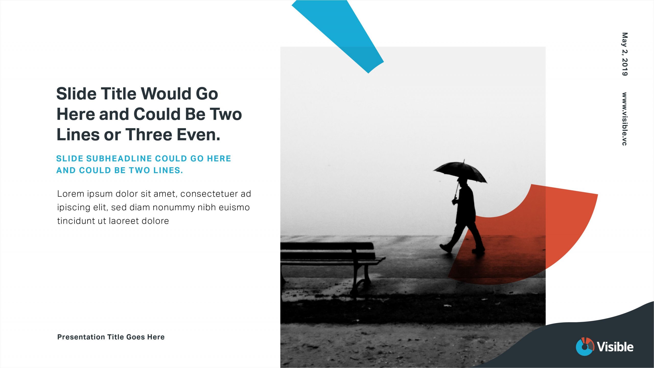
Create variation within your slides.
Total uniformity throughout your slides is a surefire way to decrease your audience’s interest in and engagement with your material. Try experimenting with the aesthetic of your title or quote slides. Let your current brand identity inspire creativity within your colors, fonts and bullets to bring more life to your slides – you want every slide to represent your brand well. Try reversing the colors on your slides – using lighter letters on a darker background – or breaking up different levels of content using bulleting and text variations, such as bolded, italicized, or varying fonts. Check out a few examples we’ve linked below!

Keep your words to a minimum.
When creating your slides, limit copy to the most high-level, concise, main idea content. Not only does this emphasize your professionalism and ability to recite memorized content, but your slides also become much cleaner and easier to digest. The more words you include on a page, the more your audience will be focused on reading your content above listening to you speaking. Let your content compliment your presentation, rather than vice versa. Follow the link below to view some examples of this method!

Bring hierarchy to your slides to increase cohesion and ease comprehension.
The best way to communicate the most relevant content and create a natural flow throughout your piece is to create hierarchy within your slides. The use of big, bold and concise titles and subtitles are extremely helpful in communicating your point clearly, and even if you do need to include a little copy to follow, hierarchy can break it up nicely. Look through some of the examples we’ve linked below to see the difference this approach can make!
Order of presentation.
Most of us are familiar with Simon Sinek’s “Start With Why” philosophy that encourages us to begin by first presenting an issue in its entirety, and then presenting our proposed solution. We like following this methodology when organizing presentation content because it makes your proposal all the more logical and engaging, and allows no room for your audience to be confused as to who you are and what you do. Ordering your presentation content in such a way that follows a linear storyline helps your audience feel invited into your presentation and your purpose.
Pictures are worth a thousand words.
Rather than squeezing your visuals into the bottom corner of your slides, consider the impact it would make to flood the screen with an image, allowing you to speak into its meaning to your audience. If your company doesn’t have an image library, I suggest using a free stock photo site like Unsplash or Pixabay to carefully select and utilize high-quality, unpixelated images that will help drive your point home. Other options for grabbing great photos include purchasing some from iStock or Shutterstock, or even reaching out to a photographer who can help you take some great shots of your company, products and services in action.